#30DayChartChallenge 2024
- Mireia Camacho
- Data visualization , R
- May 3, 2024
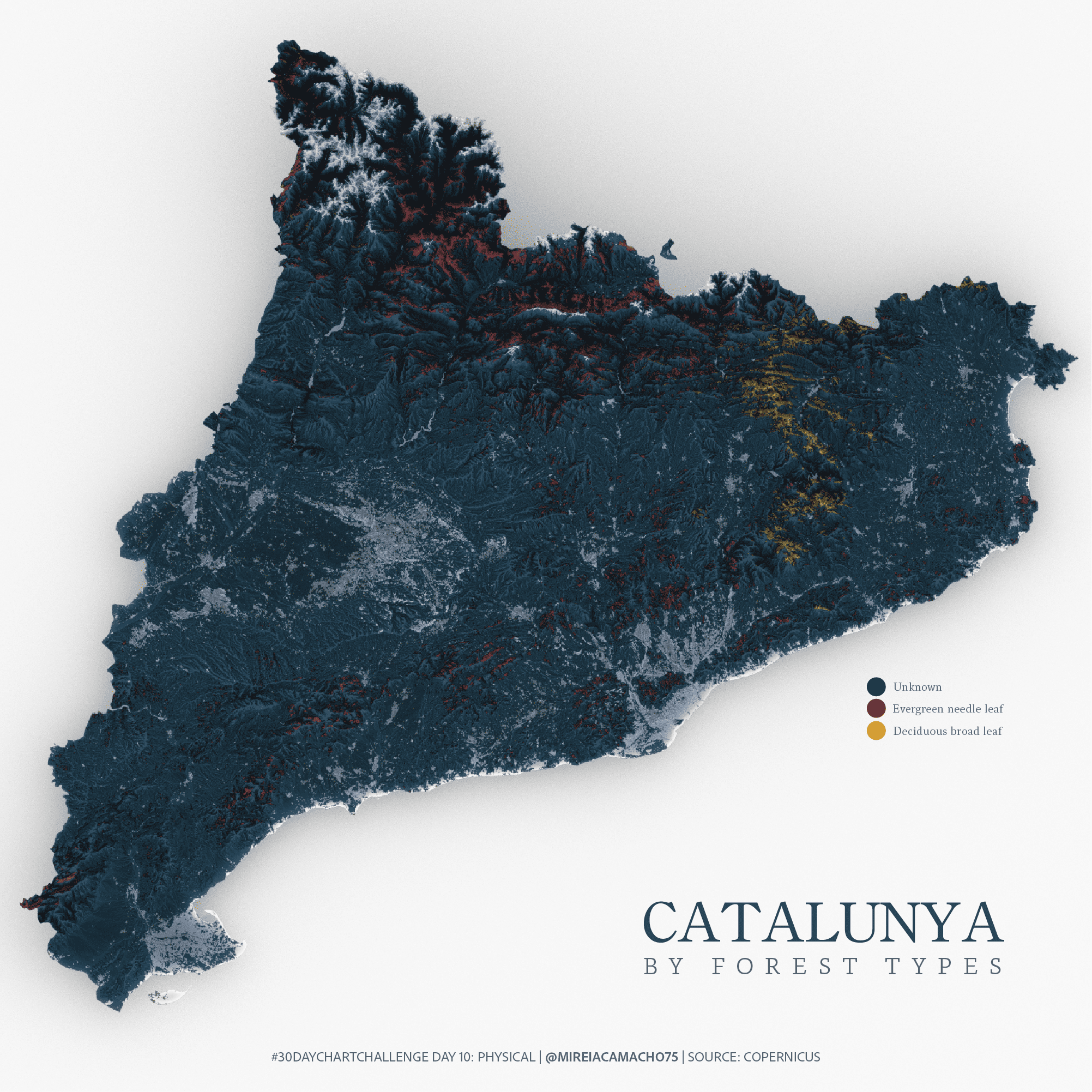
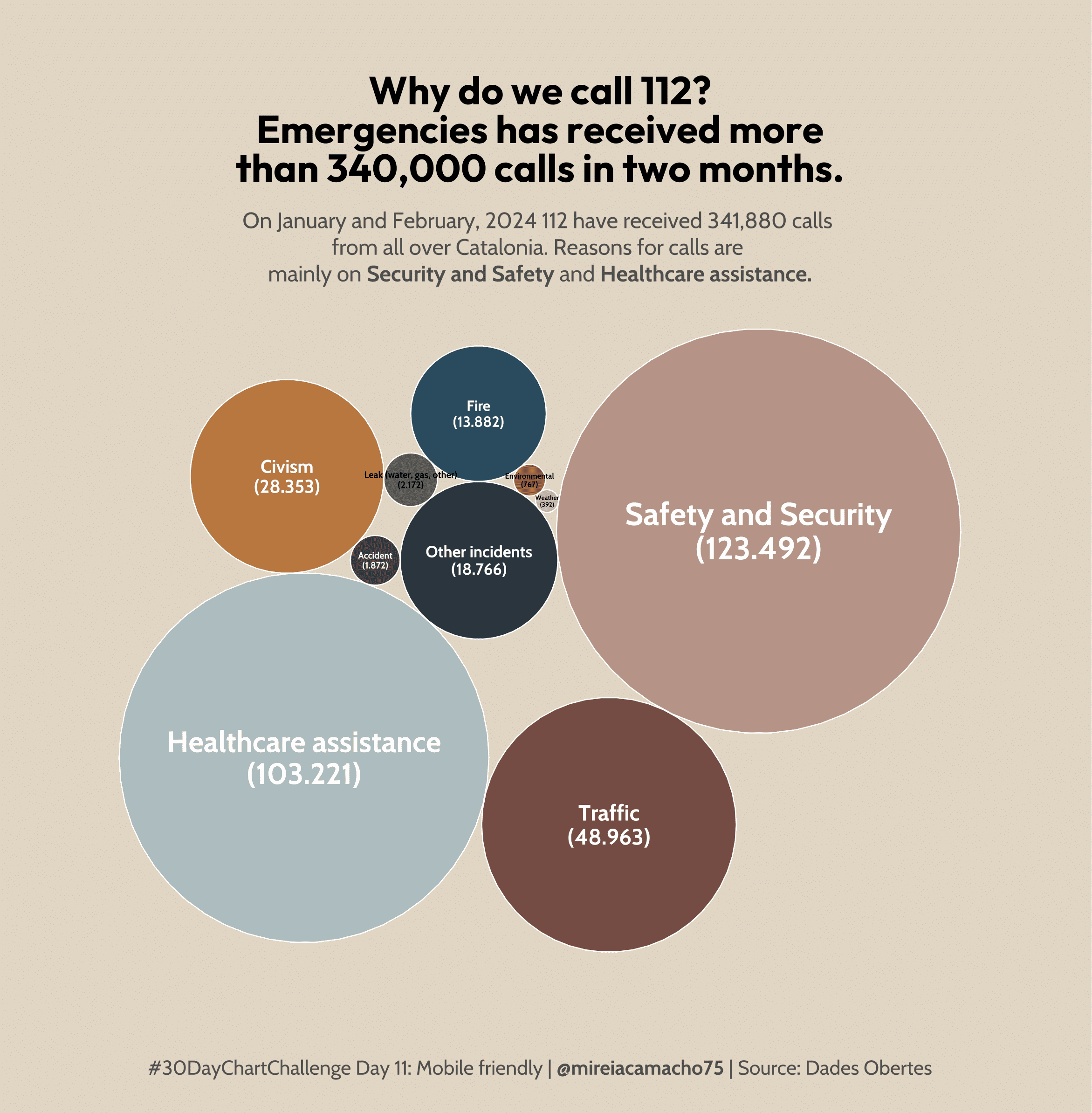
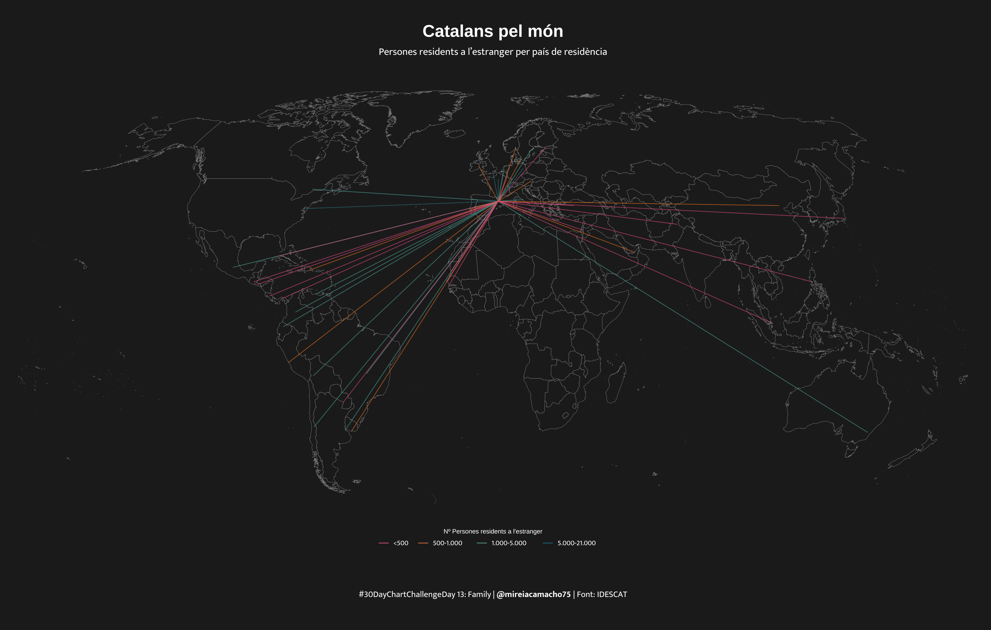
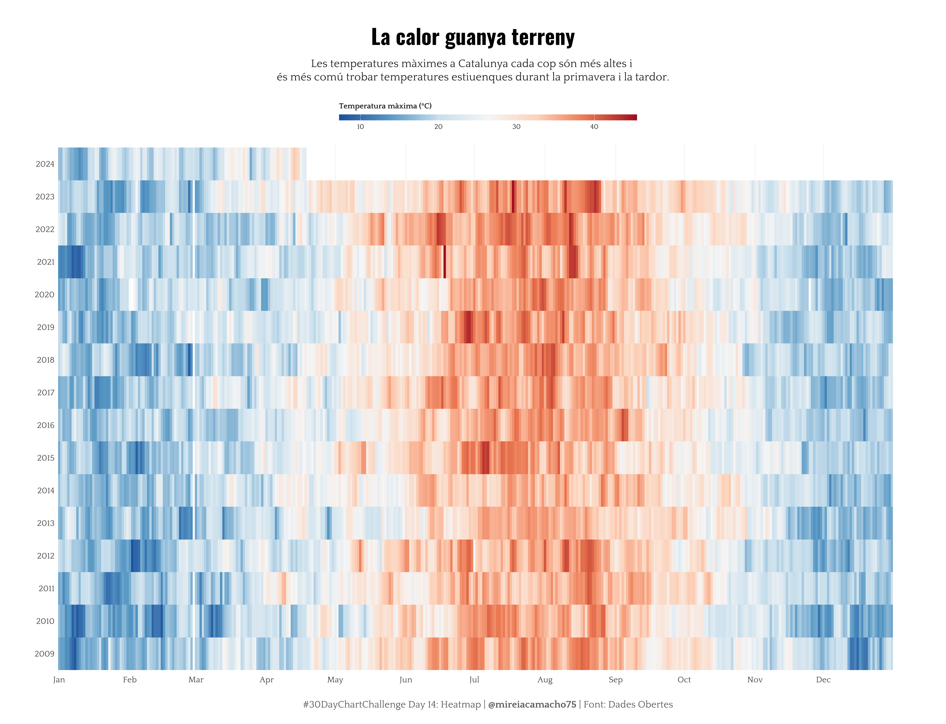
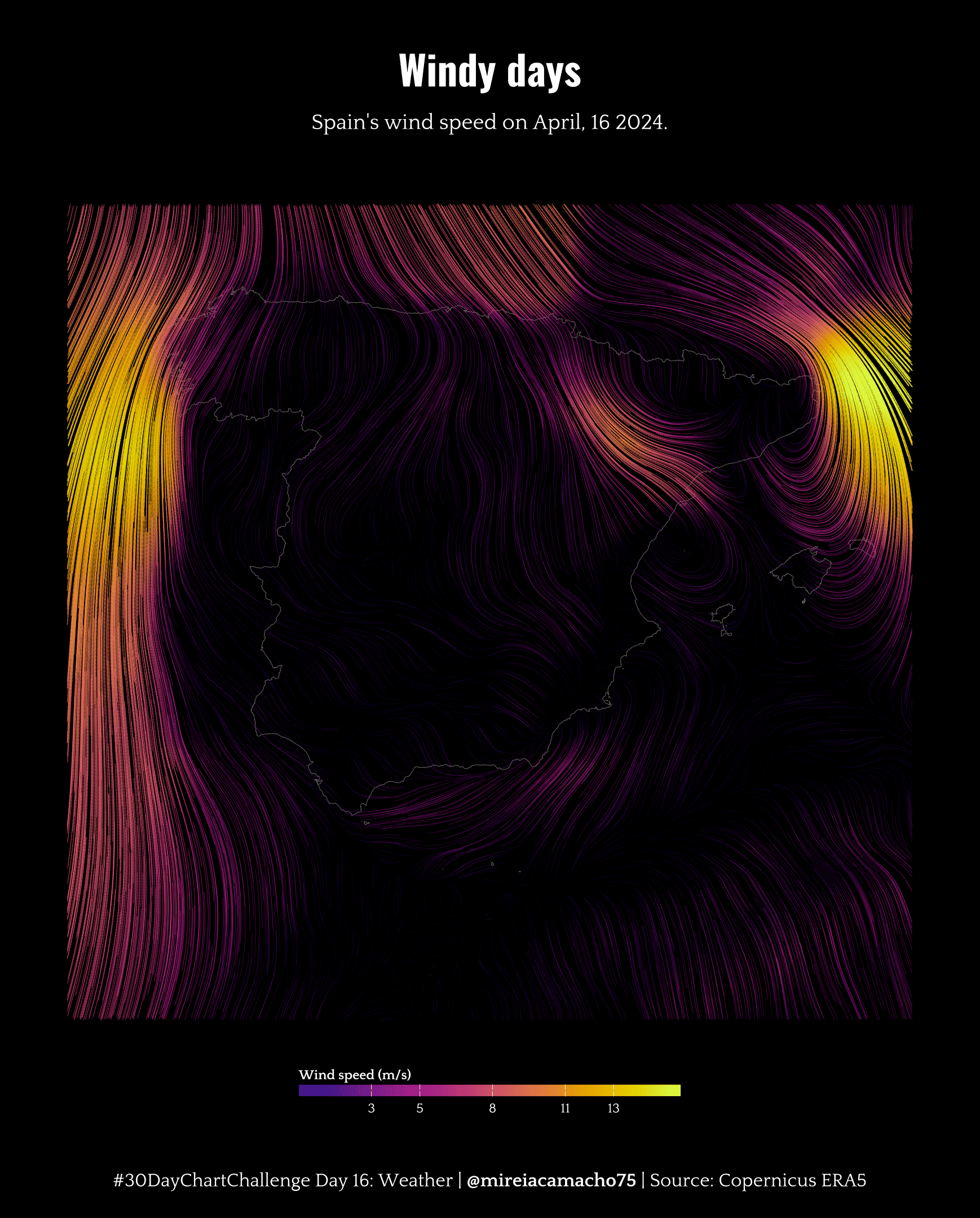
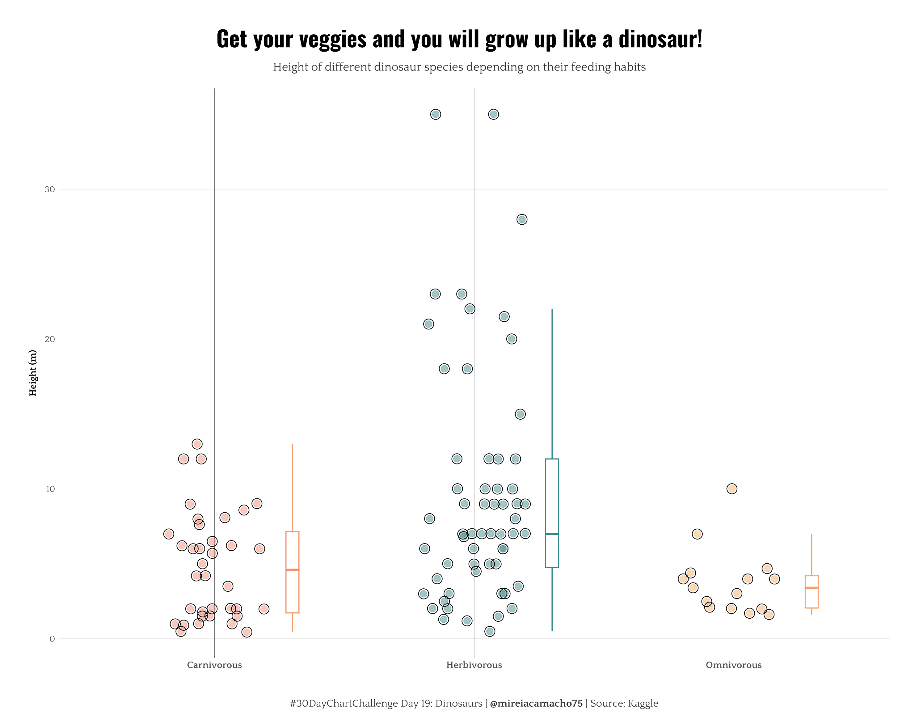
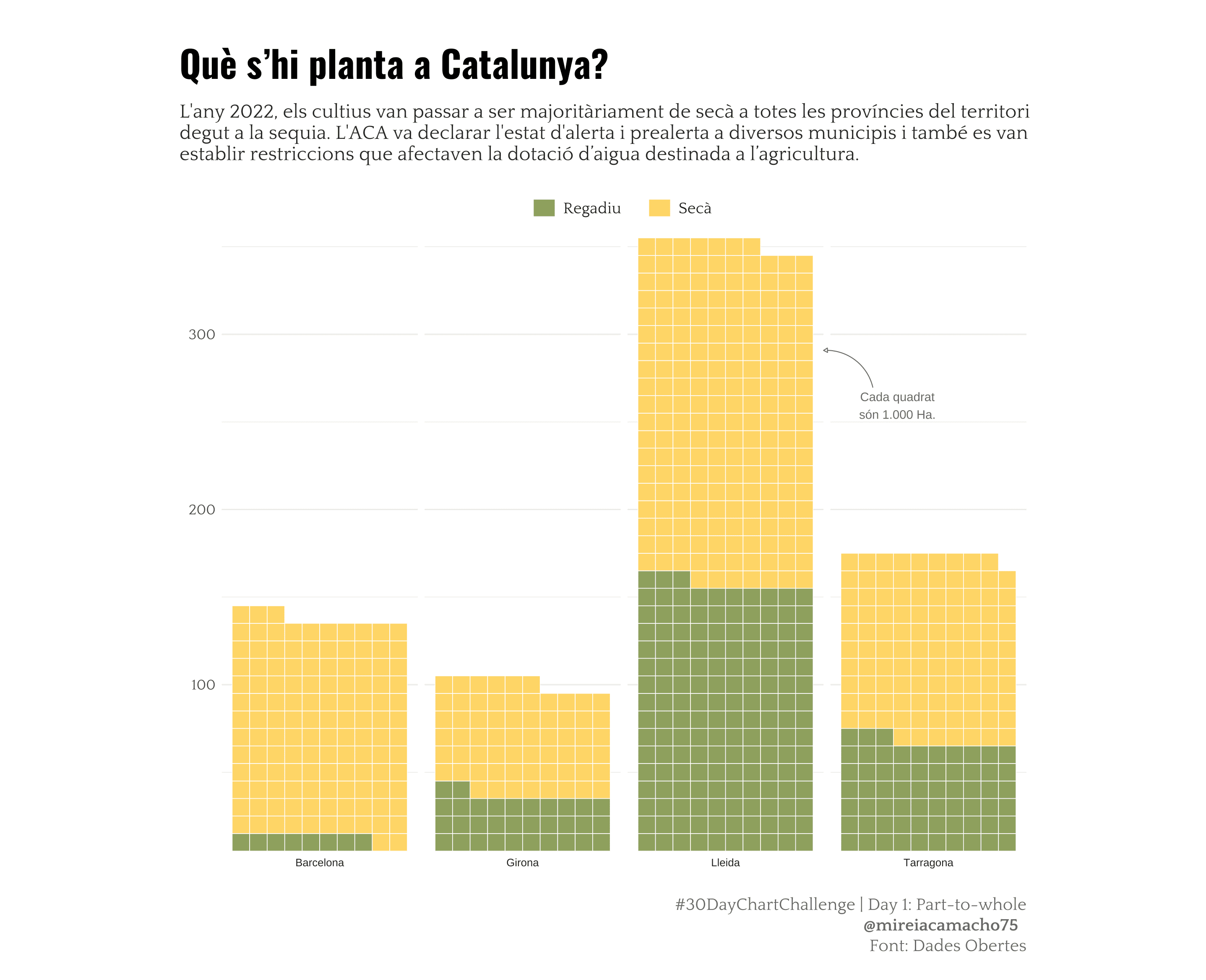
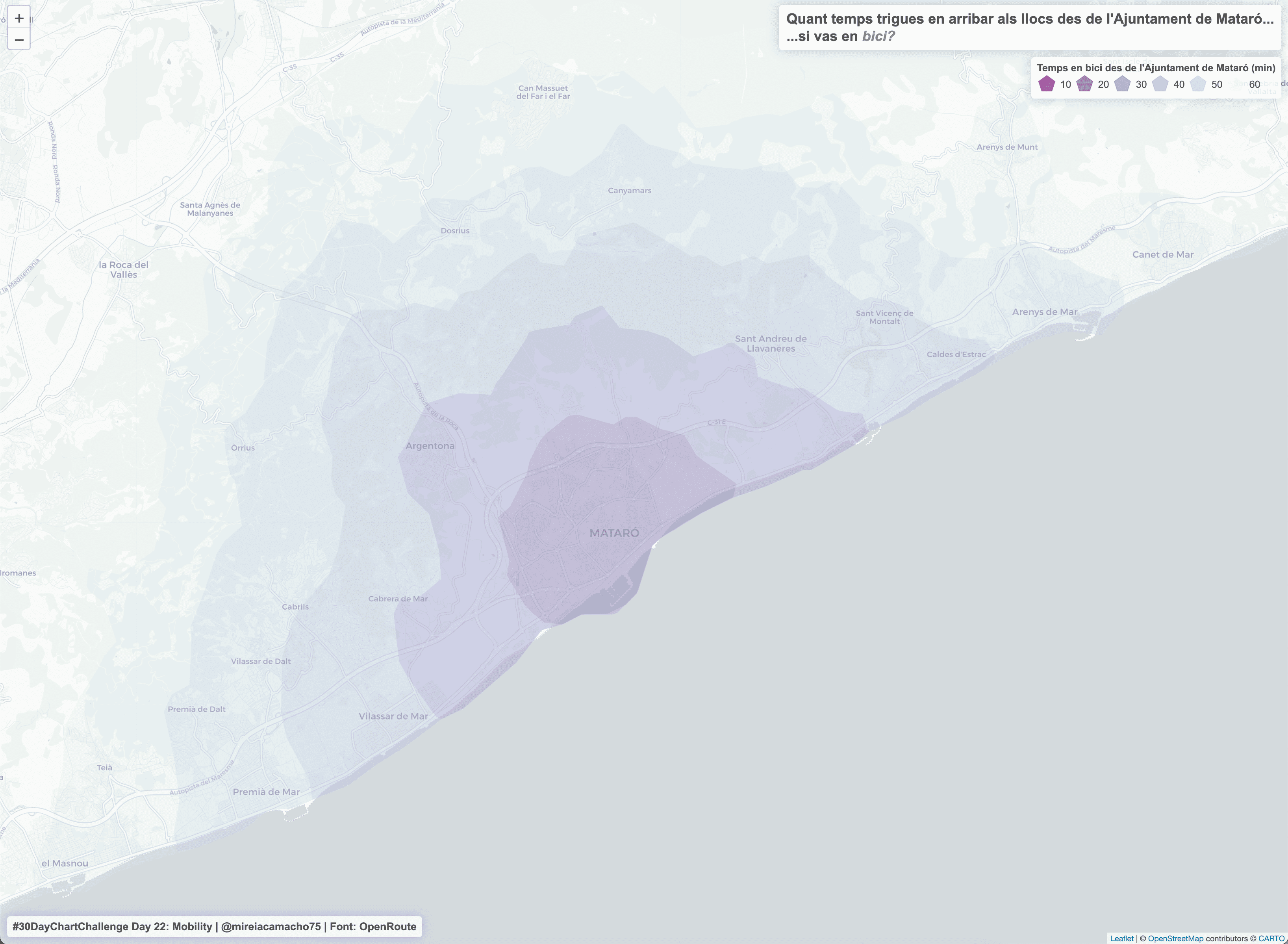
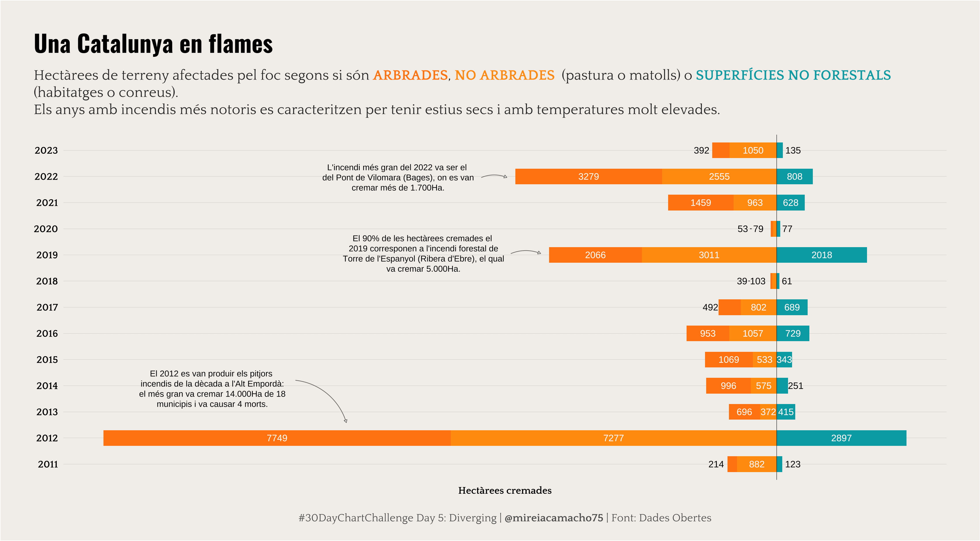
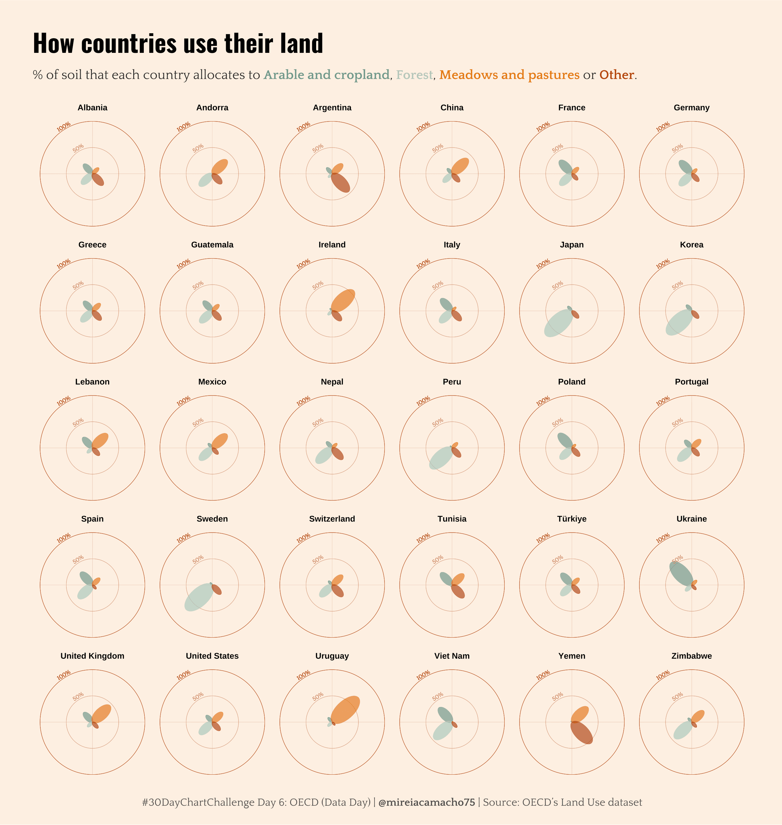
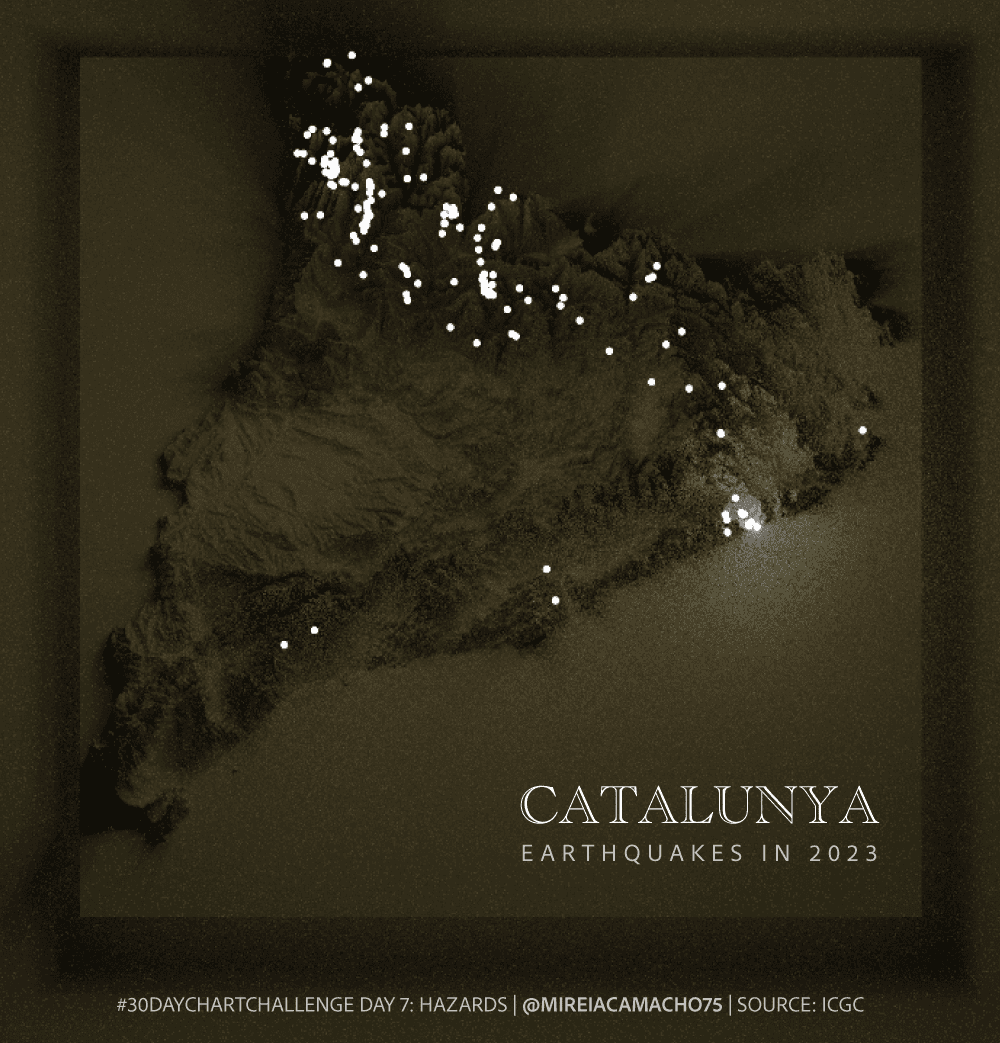
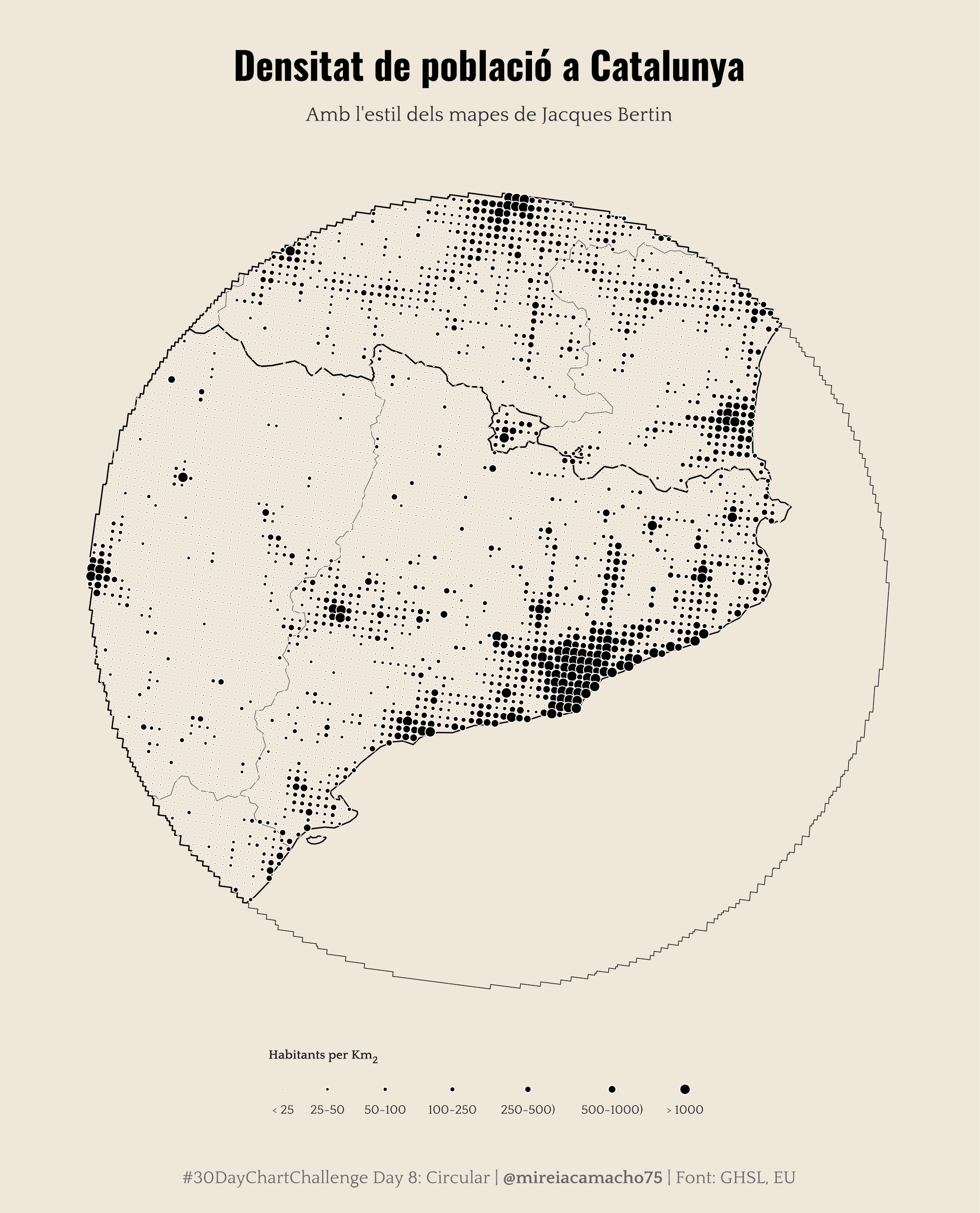
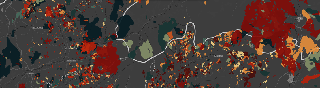
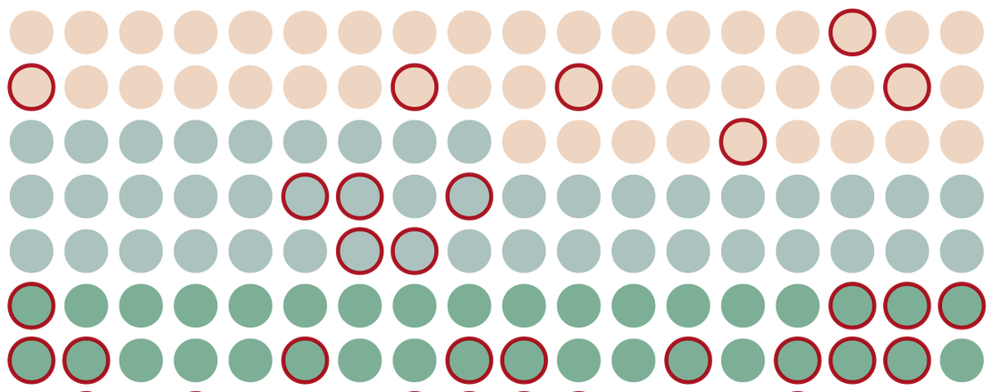
This year we actively participated in the #30DayChartChallenge and here are the results!
Tip
This project can continue thanks to our patrons. If you also want to collaborate you can do it here .
The #30DayChartChallenge is a challenge that encourages the community to make a data visualisation every day of April following a guide that indicates the type of chart to make or the theme to follow. Participants can join in using the social network of their choice.
Besides this, I decided to use the Dades Obertes datasets of the Generalitat de Catalunya whenever there was data related to the theme of the day. The good thing about this is that almost all the datasets are documented and clean, so I had to spend little time cleaning the data and I could focus on the design of the visualisations.
To my surprise, Datawrapper added one of my graphs in a blog post about “the best data visualisations of the week”.
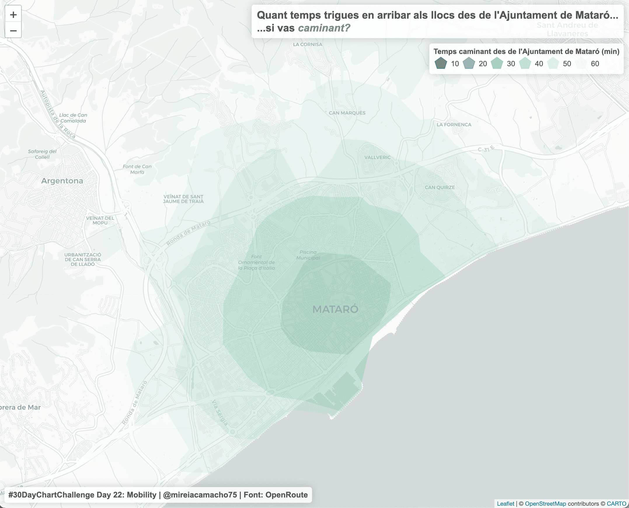
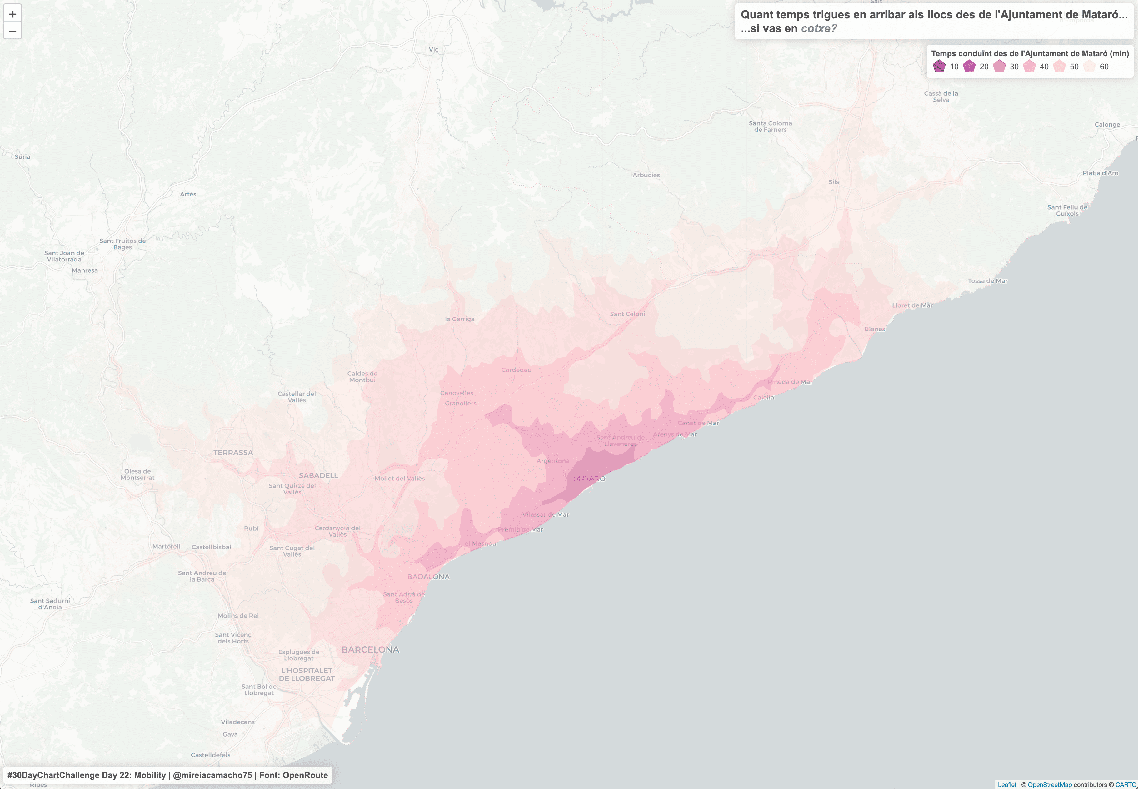
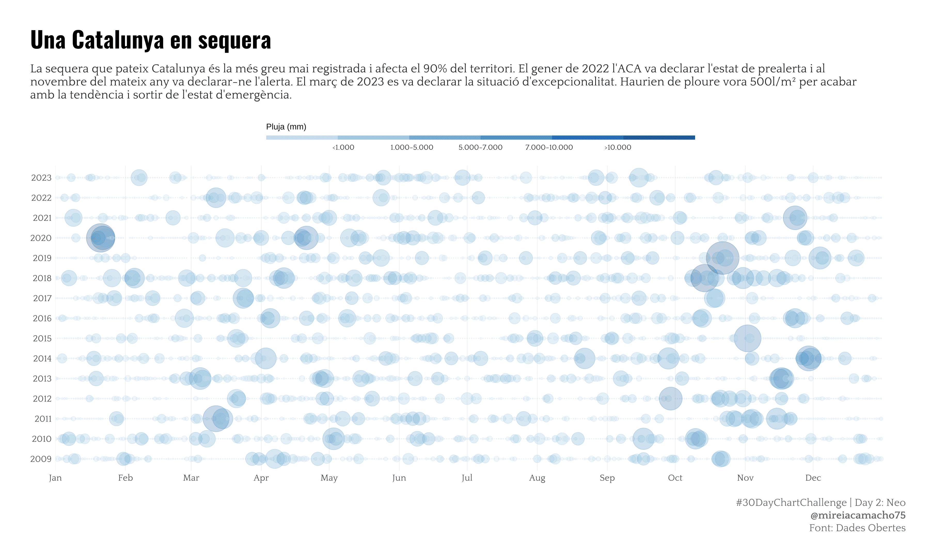
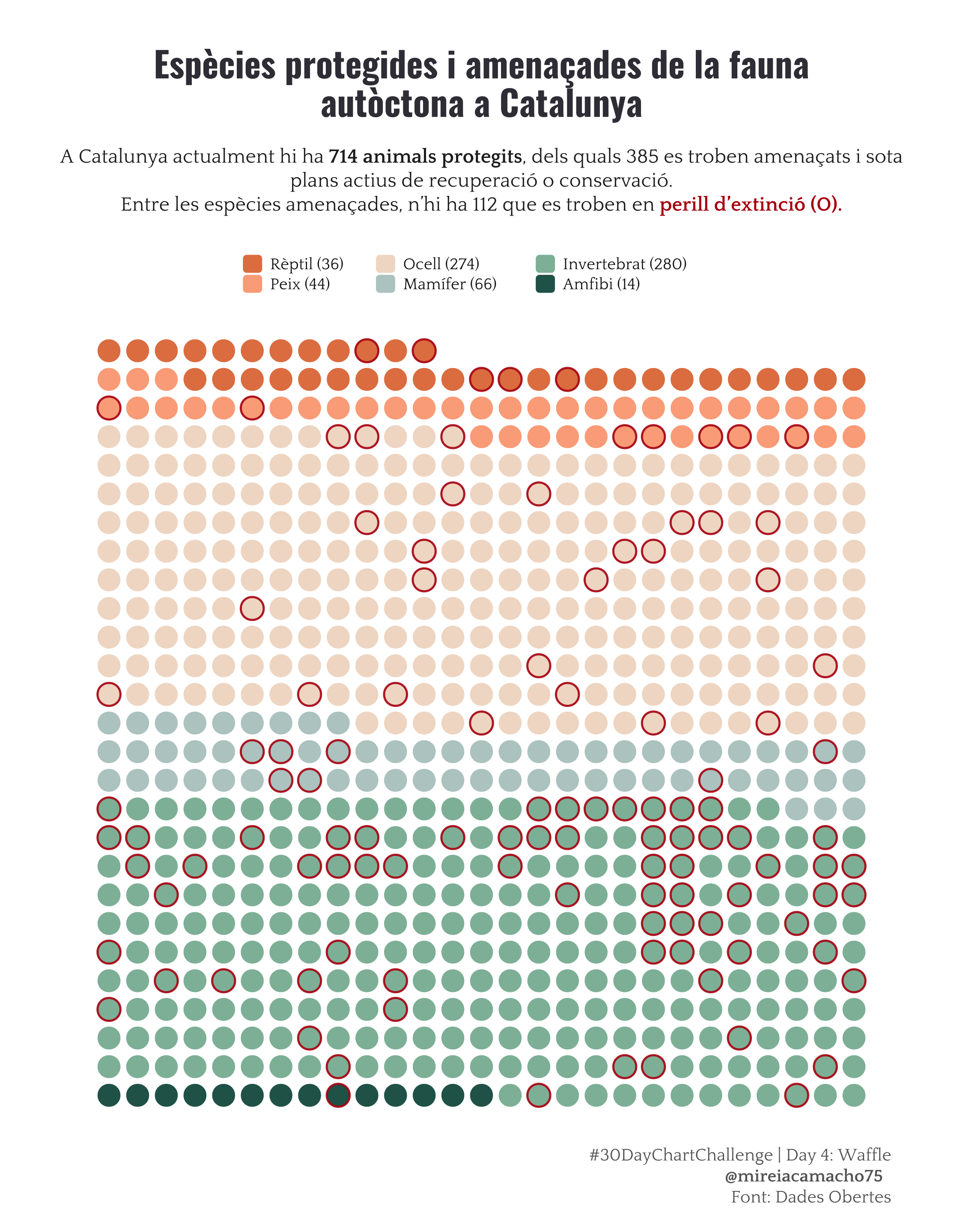
Enjoy the visualisations I published for the challenge. I hope you like them!